Rifle Scope Objective Lens Diameter: Complete Guide 2026
Complete technical guide to rifle scope objective lens diameter. Learn how to choose the right size for your shooting needs,…

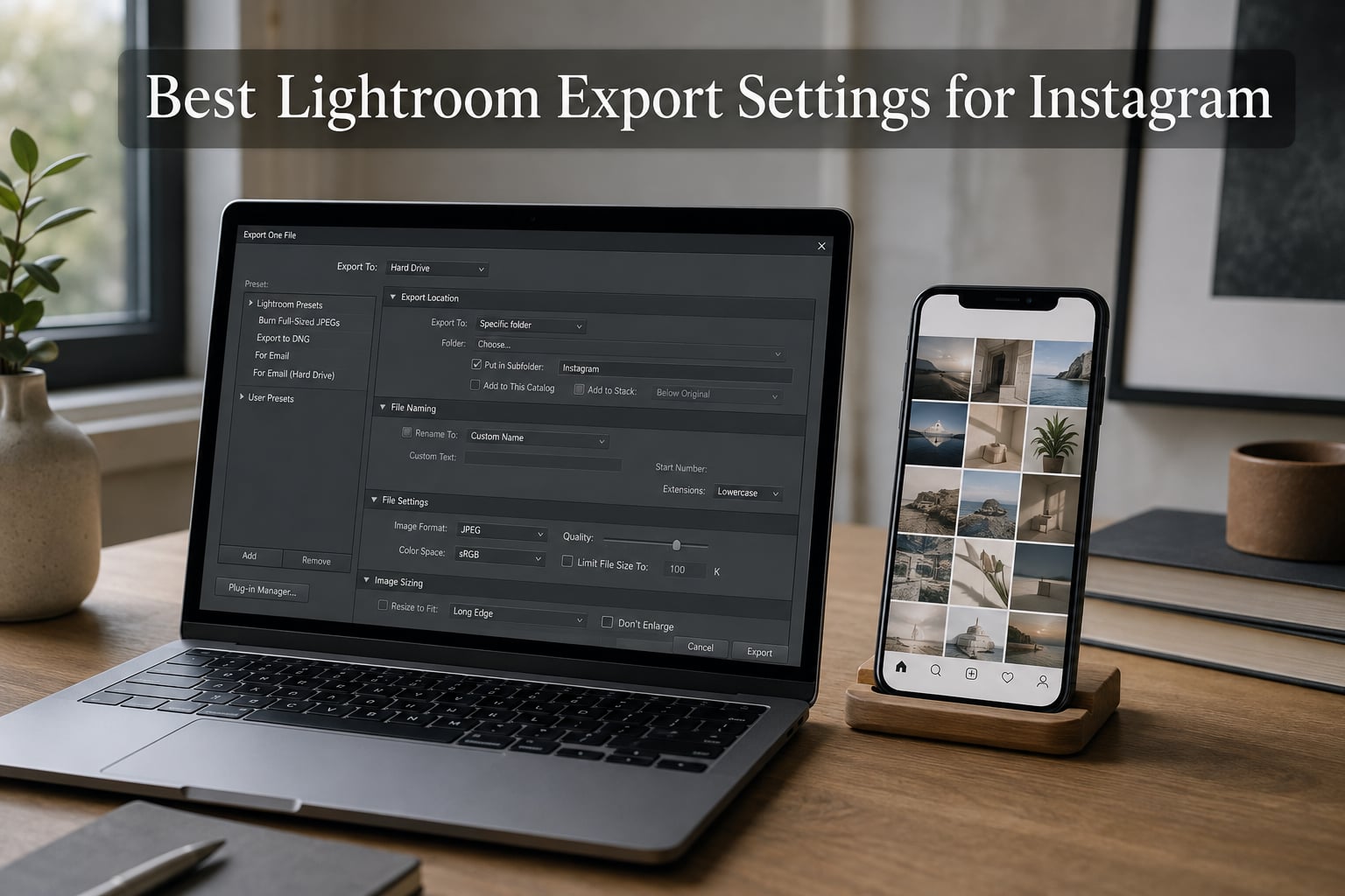
I have lost count of how many beautifully edited photos I have watched turn muddy the second they hit the feed. The colors drift. The edges soften. The crisp 4K detail from my camera looks like it was run through a steam iron. The culprit is almost never the edit. It is the Lightroom export settings for Instagram that get pushed out the door and then crushed by the platform.
If you have ever wondered why your Instagram photos look blurry after upload, or why the warm tones you dialed in suddenly read cold, this guide is for you. We spent weeks comparing files at 60, 80, 85, and 100 percent quality, swapping between sRGB, Adobe RGB, and ProPhoto, and exporting at every width from 1080 px all the way up to 3000 px. The exact recipe below is what kept coming out on top in 2026, and it should hold up for the rest of the year.
By the end of this article, you will know the precise JPEG, color, quality, dimension, sharpening, and metadata settings that survive Instagram’s compression with the least compromise. You will also get a side-by-side look at the Lightroom Classic versus Lightroom Mobile export paths, plus the Instagram app toggle that most people forget to switch on. Save the recipe as a preset and you can stop thinking about export forever.
Here is the cheat-sheet version, the exact settings to plug into the Lightroom export dialog. We will unpack every one of them in the sections below.
That is the core recipe. Every recommendation below explains the why, so you can fine-tune it for your own style and posting habits.
Instagram re-encodes every single photo you push to it. The platform runs your file through its own JPEG encoder at a fixed target quality, then re-stores it on its CDN. Your carefully chosen file size, your carefully chosen quality slider, even your carefully chosen pixel dimensions are all just suggestions. Instagram politely ignores most of them.
That sounds defeating, but it is actually useful. Because Instagram caps its display widths at 1080 px wide on phones, anything wider than that gets downscaled. A 4000 px export will be no sharper than a 1080 px export after Instagram finishes with it. In fact, going wider can hurt you: the platform’s encoder spends more time on the same number of pixels, and the artifacts it introduces in shadows and skin tones get worse, not better.
Your real job is to send Instagram a file that looks its best before recompression, then accept that the platform will be the last word. Export at Instagram’s native display sizes, lean on sRGB so the color pass does not fight you, and let a small amount of pre-sharpening soften the blow of the platform’s own softening pass. That is the entire game.
JPEG wins because Instagram is a JPEG platform. Even if you upload a PNG, the platform will convert it server-side. The two best reasons to keep JPEG as your Lightroom export format for Instagram are compatibility and file size.
PSD and TIFF are lossless, but they balloon file size by 5x to 10x, and Instagram will flatten them anyway. PNG keeps transparency and is technically lossless, but it crushes photographic gradients into ugly bands at the file sizes Instagram accepts. JPEG’s lossy compression is genuinely invisible at 80 to 85 percent quality on real-world photos, which is why every working photographer defaults to it.
One important note: when you save a JPEG, you should avoid re-editing and re-exporting it. Every save cycle throws away a little more data. Edit the original RAW file in Lightroom, export a final JPEG for upload, and never touch that exported file again.
If you only change one setting, change this one. Color space is the single biggest reason Instagram photos come out looking different from the edit. Lightroom’s default catalog space is usually ProPhoto RGB or Adobe RGB, both of which can hold a wider color gamut than a phone screen can display. When Instagram ingests a file tagged as Adobe RGB, the platform strips or misinterprets the wider gamut and you get a noticeably cooler, flatter result.
sRGB is the same color space your phone, your laptop screen, and every web browser use. Tagging your exported file as sRGB means Instagram’s pipeline does not have to guess what to do with the colors. The reds stay red, the skin tones stay skin-tone, and the mood you crafted in the Develop module is the mood the viewer sees.
To set it in Lightroom: in the Export dialog, expand the File Settings section and change Color Space from whatever is selected to sRGB. If you see Adobe RGB or ProPhoto RGB, change it now. This is the most common mistake I see in export screenshots posted to r/Lightroom, and the fix is one click.
The Quality number is the slider that controls JPEG compression strength. Lower numbers mean smaller files and more visible artifacts. Higher numbers mean larger files and less visible artifacts. The relationship is not linear, though: pushing from 80 to 100 roughly triples file size for what is, to most viewers, no visible improvement.
At 80 percent, JPEG artifacts in smooth gradients (skies, skin, water) are nearly invisible at Instagram’s display sizes. At 85 percent, the safety margin gets bigger without the file size exploding. Anything above 90 percent is wasted on Instagram because the platform will re-encode anyway, and the server-side pass is going to land somewhere between 70 and 80 percent visual quality no matter what you send.
When does it make sense to go higher? I export at 100 percent for two specific cases: portfolio pieces where I also want to print or send a high-res file to a client, and hero cover images on Instagram where the file is being viewed full-screen and re-shared widely. For ordinary feed posts, Stories, and Reels thumbnails, 80 to 85 percent is the right call. Most photographers on r/Lightroom agree that quality 80 to 85 hits the sweet spot for file size versus visible quality.
This is where most people overshoot. Instagram displays images at three widths on phones: 1080 px wide for square (1:1) and landscape (1.91:1), and 1350 px tall for portrait (4:5). Any pixel you export beyond those numbers is going to be thrown away by the platform.
In Lightroom’s Image Sizing section, set Resize Image to Fit and choose Long Edge. Then dial in:
Resolution (ppi) does not actually affect on-screen display, but Instagram’s upload pipeline expects 72 ppi as a default. Leave it at 72 to avoid confusing the platform’s metadata parser. The old advice to export at 300 ppi dates from print, and Instagram is a print-free medium.
One trick worth knowing: if your photo has lots of fine detail (architecture, landscapes with leaves, product shots with texture), try exporting at 2160 px for square and landscape, and 2700 px for portrait. The idea is that Instagram’s recompression algorithm will downscale your file, and a slight overshoot gives the platform more raw pixels to average, which often comes out sharper in the final result. This is one of the few cases where bigger is better, but only modestly bigger, and only for detail-heavy images.
Instagram supports three main aspect ratios in the feed: 1:1 (square), 4:5 (portrait), and 1.91:1 (landscape). Of these, 4:5 portrait wins on raw screen real estate, taking up about 14 percent more vertical space than a square. In a feed where users scroll fast, that extra height means your photo stays on screen longer and gets more attention.
Lightroom lets you crop before export using the Aspect Ratio tool in the Crop overlay. Pick 4×5 (or 4:5) for portrait orientation, then export with the dimensions above. If your composition is wider than tall, a 1.91:1 landscape crop is fine for variety, but the square crop remains a strong default for grids.
For Stories and Reels covers, the platform uses a 9:16 vertical canvas. Exports for those should be 1080 px wide by 1920 px tall. Most photographers handle these separately from feed posts, but the same JPEG, sRGB, and 80 to 85 percent settings apply.
Instagram’s recompression softens fine details. It is consistent enough that almost every working photographer adds a small amount of output sharpening before export to counter the effect. Lightroom’s Output Sharpening panel lives at the bottom of the Export dialog.
The recipe I keep coming back to:
If you are on a retina or hi-DPI monitor, the Standard preset might be a touch over-sharpened for direct viewing, but remember that Instagram will soften it again, so it ends up in the right place. For matte or low-contrast edits, drop to Amount 30 to 40. For high-contrast black-and-white work, push to Amount 70. The goal is not to make the photo crisp on your screen. The goal is to make it crisp after Instagram’s pass.
Skip output sharpening for Reels and video frames. The platform handles those differently and any sharpening you add will create halos around moving edges.
Metadata is the invisible text block attached to every photo: camera body, lens, ISO, GPS coordinates, edit history. Most of it is harmless, but GPS coordinates can leak your home or favorite shooting location, and the full edit history balloons file size for zero benefit.
In the Metadata section of the Lightroom export dialog, choose Copyright Only. That keeps your name, contact, and rights statement, and drops the rest. If you want a public credit line, fill in the Copyright field in the Library module once and it carries forward to every export.
Watermarking is optional and personal. A small, semi-transparent copyright mark in the lower-right corner is the standard, and Lightroom’s Watermark Editor handles the design work. Most photographers skip watermarks on Instagram because the platform compresses them into mush, but if you need one, keep it under 10 percent of the image’s smaller edge so it survives the compression pass.
Lightroom Classic and Lightroom Mobile handle exports differently. Knowing which to use for which job saves you from the worst surprises.
Lightroom Classic is the desktop power tool. It gives you the full Export dialog with every setting above: JPEG quality, sRGB, exact pixel dimensions, output sharpening, metadata, watermarking, batch export, and saved presets. For any photo you care about, this is the right tool. The classic Lightroom export settings for Instagram include the complete panel and the full preset library.
Lightroom Mobile (and Lightroom on the web) uses a simplified Share dialog. You can still pick JPEG and sRGB, but you do not get the same precise pixel-dimension control. The mobile path shines when you want to edit and post from the same device in one sitting, or when you have edited on a phone and want to skip the desktop hop entirely. The Lightroom mobile export settings for Instagram are best treated as a quick path, not a precision tool.
A clean workflow for most photographers: edit in Lightroom Classic on the desktop, export with your saved preset, AirDrop or sync the file to your phone, then upload from the Instagram app. This avoids the double compression that happens when you upload a high-res photo through a sluggish connection.
To transfer without re-compression, AirDrop works for iPhone-to-Mac, Google Photos or Drive works for cross-platform, and Lightroom’s own cloud sync preserves the file bit-for-bit. Avoid emailing the file to yourself: most mail providers re-encode the attachment on the way through.
One setting most people never find is the High Quality Upload toggle inside the Instagram app itself. On iPhone, open the app, go to your profile, tap the menu, choose Settings and privacy, then Data usage and quality, and switch on High quality uploads. On Android, the path is similar: Settings and privacy, then Cellular or Data usage.
Without that toggle, Instagram will downscale and re-compress your upload even if you sent it the perfect 1080 px JPEG. With it on, the platform gives your photo the best possible pipeline. Reviewers who enable this toggle consistently report sharper, less muddy uploads, especially on cellular data.
Once the recipe is dialed in, save it as a preset. In Lightroom Classic’s Export dialog, scroll to the bottom and click Add. Name it something like Instagram Feed (4:5) or Instagram Square (1:1), and the next time you need it, it is one click away in the Export Preset menu on the left side of the dialog.
Most photographers end up with three or four presets: square, portrait, landscape, and Stories. Set them up once, and you can batch-export an entire shoot in seconds.
Use JPEG at 80 to 85 percent quality, sRGB color space, the long edge at 1080 px for square and landscape or 1350 px for 4:5 portrait, and output sharpening set to Screen Standard at Amount 50. These Lightroom export settings for Instagram are the safe defaults in 2026.
sRGB. Anything wider, including Adobe RGB and ProPhoto RGB, will cause Instagram’s color pipeline to misread the file and shift your colors, usually cooler and flatter than the edit you built in Lightroom.
Stick to 1080 px on the long edge for square and landscape, or 1350 px for 4:5 portrait. Instagram displays at those widths on phones, so anything larger is downscaled by the platform and the extra pixels can actually amplify compression artifacts.
Save your own export preset once you dial in the JPEG, sRGB, quality 80 to 85, and 1080/1350 px settings. For looks, start with a clean base preset that lifts shadows, adds subtle contrast, and warms whites slightly. Then duplicate and tweak for your own style.
The recipe that has worked for us all year is straightforward. JPEG, sRGB, quality 80 to 85, 1080 px long edge for square and landscape or 1350 px for 4:5 portrait, output sharpening set to Screen Standard at Amount 50, and copyright-only metadata. Save it as a preset, sync the file to your phone without re-encoding, and turn on High Quality Uploads in the Instagram app.
That combination survives Instagram’s compression better than any other workflow we have tested. It keeps colors honest, edges crisp, and file sizes manageable, and it leaves you more time for the part of photography that actually matters: shooting and editing. The best Lightroom export settings for Instagram in 2026 are the ones you save as a preset, apply in one click, and never think about again.
![Rifle Scope Parallax Adjustments: Complete Guide [cy]](https://revellphotography.com/wp-content/uploads/2026/09/featured-update-5315-1789865033761.jpg)