7 Best Photoshop Alternatives (September 2026): Top Picks
I tested the seven best Photoshop alternatives that do not lock you into Adobe’s subscription, and what I found surprised…

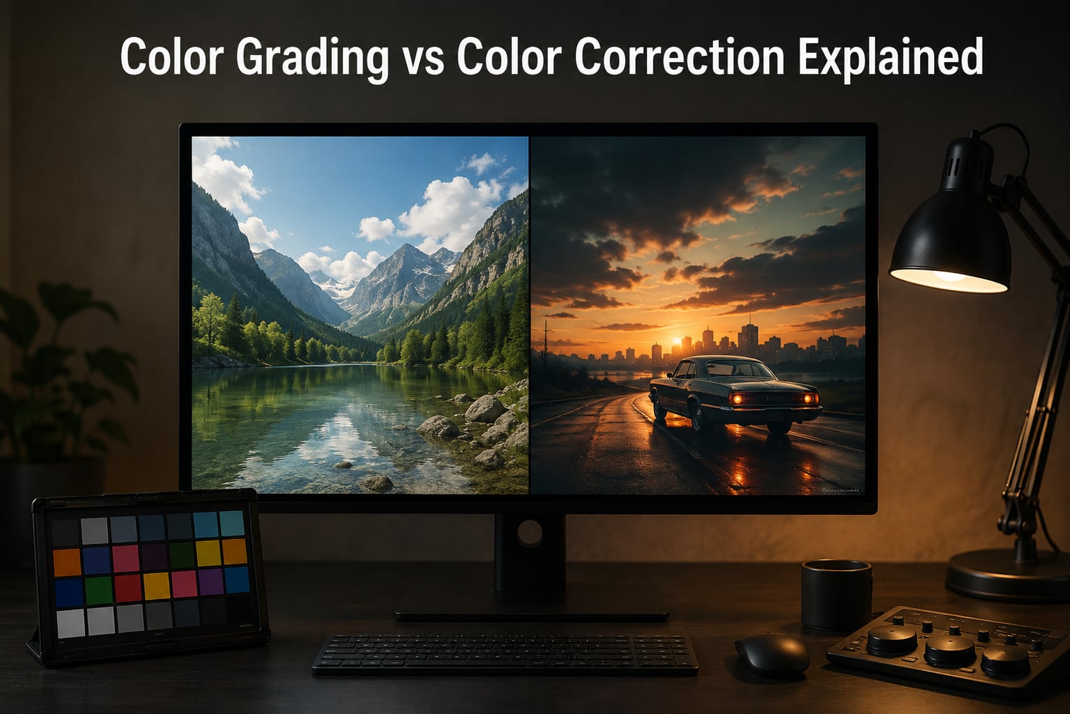
Color correction is a technical process that balances an image so colors look natural, while color grading is a creative process that applies a specific mood or visual style on top of that balanced image. They sound similar, and most editors use the terms loosely, but the two steps do completely different jobs in any photo or video workflow.
I have spent the last decade grading wedding films, portraits, and product stills, and the single biggest mistake I see from beginners is mixing these two steps together. When I started out, I skipped correction and went straight to grading, then wondered why my cinematic looks looked muddy or inconsistent. Once I learned the order, everything clicked.
In this guide, our team breaks down color grading vs color correction so the difference is clear from the first paragraph. You will learn what each process does, the tools to use, the workflow order professionals follow, the 60/30/10 rule, and the most common mistakes that quietly ruin otherwise good edits. If you also want a deeper look at how color affects optics, our guide on apochromatic lenses and chromatic correction covers the camera side of the equation.
Color correction is the technical fix-it stage of post-production. Its only job is to make the footage or photograph look accurate, balanced, and natural before any creative choices are made. You are not adding mood here. You are removing problems.
The most common issues color correction solves are wrong white balance, underexposure or overexposure, low contrast, color casts from mixed lighting, and inconsistent exposure between shots in the same scene. Editors use scopes like the histogram, waveform monitor, and vectorscope to measure these problems objectively instead of trusting their eyes alone.
In practice, correction covers a small set of repeatable adjustments: setting the correct white balance so whites look white and skin tones look right, normalizing exposure across a sequence so cuts between shots feel seamless, recovering blown highlights or crushed shadows, neutralizing any color cast introduced by tungsten, fluorescent, or mixed lighting, and adjusting contrast so the image has a clean tonal range from black to white.
The output of a well-corrected image is technically correct, neutral, and ready for the next stage. It will not look especially exciting on its own. That is the point. Correction is the clean canvas the artist will paint on.
Color grading is the creative stage where you apply a visual style, mood, or emotional tone to an already-corrected image. This is where you decide the photograph feels warm and nostalgic, cold and clinical, cinematic and teal-and-orange, or any other look you can imagine.
Grading is what makes a Marvel film feel different from a Wes Anderson film. It is what makes a fashion editorial look like Vogue instead of a candid smartphone shot. Grading is storytelling through color, and it is the step that turns technically clean footage into a finished piece with personality.
The techniques used during grading include split toning, where shadows are pushed one color and highlights another, applying LUTs as a starting point, which are preset color transformations used across whole films, balancing the image against the 60/30/10 color rule, creating a cohesive look across an entire project so every shot feels part of the same world, and pushing colors beyond natural reality to support emotion, time of day, or genre.
Grading is subjective. There is no correct answer, only what supports the story or the brand. A good grade is intentional, and a viewer feels it even when they cannot name it.
The clearest way to see the difference between color correction and color grading is to compare them side by side. Both happen in post-production, both use the same tools, and both adjust color. The difference is purpose, intent, and where they sit in the workflow.
| Aspect | Color Correction | Color Grading |
|---|---|---|
| Purpose | Make the image technically accurate | Apply a creative style or mood |
| Approach | Objective, guided by scopes | Subjective, guided by intent |
| When it happens | First, before any creative work | Last, after correction is done |
| Common tools | White balance, exposure, contrast, curves | Split toning, LUTs, look design, secondary correction |
| Output | Neutral, balanced, natural | Stylized, emotional, branded |
| Measured by | Histogram, waveform, vectorscope | Reference images, mood boards, story |
| Skill set | Technical, repeatable | Creative, artistic |
You can grade without correcting first, but the result will be unstable. Any underlying exposure or white balance issue gets magnified by the grade and is much harder to fix afterward. That is why professional pipelines run correction first, every single time.
Correction has a handful of core techniques. If you learn these well, you can fix roughly 90% of issues you will meet on a typical shoot.
White balance. White balance is the temperature of the light in the scene, measured in Kelvin. Tungsten lights run warm around 3200K, daylight is around 5500K, and shade can push past 7000K. The goal is to neutralize the color cast so whites look neutral gray and skin tones look healthy. Most raw files let you set this after the fact, which is why shooting raw matters.
Exposure. Exposure sets how bright or dark the overall image is. A clean exposure keeps detail in both the brightest highlights and the deepest shadows. Use the histogram to confirm you are not clipping either end.
Contrast. Contrast is the difference between the darkest and lightest tones. Too little contrast makes the image look flat and hazy. Too much makes it look crunchy and harsh. A good correction lands the image in the middle, with rich blacks and clean whites but no lost detail.
Saturation and vibrance. Saturation controls the intensity of all colors equally. Vibrance is gentler and protects skin tones from being over-pushed. Both are useful, and most correction passes leave these close to default before grading pushes them around.
Using scopes. The histogram shows your tonal distribution. The waveform shows exposure at a pixel level. The vectorscope shows color balance and saturation. Relying on your eyes alone is the single biggest mistake beginners make. Scopes tell you the truth even when your monitor is wrong.
Once correction is locked, grading begins. These are the techniques that turn a balanced image into a finished piece.
Split toning. Split toning pushes shadows one color and highlights another. The classic cinematic teal-and-orange look uses teal shadows and warm orange highlights, which is why skin tones pop and skies feel cool. Split toning is the foundation of most stylized looks.
LUTs. LUT stands for Look Up Table. A LUT is a saved color transformation you can apply with one click. They are a starting point, not a final answer. Pros use a LUT to get 80% of the way there, then refine with their own adjustments.
Reference grading. Pick a reference image or frame from a film you love and grade your footage to match its color palette. This is the fastest way to develop a consistent look across a project and is how most colorists train their eye.
Genre-specific grading. Cinematic drama leans teal-orange. Fashion shoots run clean with lifted blacks. Landscapes often go for bold contrast and rich greens. Portraits usually favor soft, warm skin tones. Each genre has unwritten rules that audiences already understand, and breaking them on purpose is a stylistic choice.
Secondary correction. Secondary correction targets specific parts of the image, like only the sky or only the skin. You isolate a color or luminance range and grade that selection while leaving everything else alone. This is where most of the detail work happens in professional grading.
The 60/30/10 rule is a color composition guideline borrowed from interior design. It says a successful image should be built from three colors: a dominant color covering about 60% of the frame, a secondary color covering about 30%, and an accent color covering the remaining 10%.
The dominant color sets the overall mood. The secondary color supports it without competing. The accent color draws the eye and creates visual interest. In landscape photography, that often plays out as 60% sky, 30% land, and 10% accent foliage or rock. In portraits, it shows up as 60% background, 30% clothing, and 10% accent accessory or skin highlight.
Color grading is where the 60/30/10 rule becomes a grading target. You can use split toning and selective adjustments to push your image into this balance even when the raw capture did not naturally sit there. For more on using color in seasonal scenes, our piece on creative fall photography ideas shows how warm accent colors carry autumn compositions.
The professional workflow order is always the same. First, ingest and organize the footage. Third, do a primary correction pass to balance exposure and white balance. Fourth, do a secondary correction pass to match shots in the same scene. Fifth, do the creative grade. Last, do final QC and export.
Skipping correction and going straight to grading is the most common mistake I see from new editors. The reason it fails is simple: every grade amplifies what is underneath. If your white balance is off, the grade will be off too. If your exposure is clipped, the grade will not fix it. Trying to grade your way out of a technical problem wastes hours and produces worse results than fixing the underlying issue first.
On a recent wedding film, our team color matched 24 shots of the same ceremony under changing outdoor light. We spent 90% of the edit time on correction and only 10% on the final cinematic grade. That ratio is normal. Correction is the long, quiet, technical work. Grading is the fast, creative finish.
These are the mistakes I see again and again, both in my own early work and in edits sent to me for review. Knowing them upfront saves you months of frustration.
Skipping the scope check. Trusting your eyes on an uncalibrated monitor is how you ship an image that looks great to you and broken to everyone else. Pull up the histogram and vectorscope on every correction pass.
Over-saturating. Cranking saturation is the visual equivalent of shouting. It hides detail, makes skin tones look fake, and dates the image the moment trends change. Push saturation gently, then back off.
Grading before correcting. If your base image is unbalanced, no amount of creative grading will save it. Lock correction first, then grade.
Inconsistent style across a project. Every shot in a wedding film, every photo in a brand campaign, and every scene in a short film needs to feel like it belongs to the same world. Pick a reference, define your look once, and apply it consistently.
Ignoring skin tones. Skin tones are how viewers decide if the image is correct, even when they cannot name what is wrong. Use the vectorscope and skin tone selectors to protect them at every stage.
You do not need expensive software to do this well, but you do need a tool that exposes the right controls.
DaVinci Resolve. The industry standard for color grading in film and video. The free version is genuinely powerful and is what most independent colorists learn on.
Adobe Lightroom Classic. The standard for still photo correction and grading. Excellent for batch work and library management.
Capture One. Favored by studio and fashion photographers for its raw processing quality and color tools.
Adobe Photoshop. Best for heavy retouching, compositing, and creative grading on individual stills.
Adobe Premiere Pro and Final Cut Pro. Solid correction and grading built into professional video editors, with Lumetri and color tools that cover most needs.
Pick one tool and learn it well. Switching tools every month is the fastest way to feel like you are always starting over.
The 60/30/10 rule says a balanced image uses three colors: a dominant color covering about 60 percent of the frame, a secondary color covering about 30 percent, and an accent color covering the remaining 10 percent. The dominant color sets the mood, the secondary color supports it, and the accent color creates visual interest.
Yes. Correction always comes first, because every grade amplifies what is already in the image. Fixing white balance, exposure, and contrast on a balanced base lets the creative grade sit on top cleanly and consistently.
The biggest mistakes are skipping the scope check and trusting uncalibrated monitors, over-saturating the image, grading before correcting the technical issues, using inconsistent styles across a project, and ignoring skin tones, which viewers use to judge whether an image looks correct.
No. Color correction is a technical process that balances an image so colors look natural and accurate. Color grading is a creative process that applies a mood or visual style on top of a corrected image. They use similar tools but serve different purposes in the workflow.
Yes. Without correction, every shot will look slightly different in white balance and exposure, and any creative grade will magnify those inconsistencies. A solid correction pass is what makes a project feel cohesive and professional.
Color grading vs color correction comes down to purpose. Correction makes the image true. Grading makes the image yours. Both matter, both belong in every project, and both need to happen in the right order.
If you take one thing from this guide, take this: correct first, grade second, use your scopes, and protect the skin tones. Do that on every edit in 2026, and your work will look more professional than 90% of what is posted on social media.