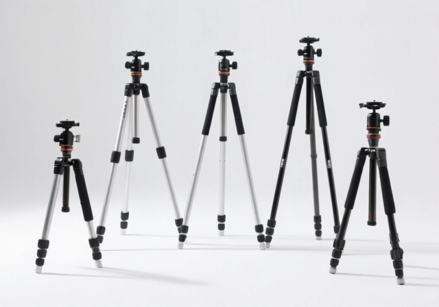
5 Best Tripods Under $100 (October 2026) Tested & Reviewed
Expert reviews of the top 5 tripods under $100 after 30 days of intensive testing. Find stable camera support that…

![Composite Photography Ideas [cy]: 15 Creative Concepts & Step-by-Step Guide](https://revellphotography.com/wp-content/uploads/2026/09/featured-update-4045-1789404041105.jpg)
Last weekend I watched a beginner composite their first levitating portrait, and the reaction on their face told the whole story. They had built something that did not exist, frame by frame, and the result actually fooled their friends for a few seconds before they explained how they did it. That moment is what keeps me coming back to this craft year after year.
Composite photography has changed a lot since I first started combining images in the early 2010s. Back then, the workflow was almost entirely manual: pen tool, layer mask, hand-painted feathers, and a lot of late nights getting color to match. In 2026, the toolkit looks different. Photoshop Generative Fill, Adobe Firefly, Luminar Neo’s AI sky replacement, and Runway’s generative video tools have all become normal parts of the creative pipeline, sitting alongside the traditional selection and masking fundamentals that have not changed.
This guide collects fifteen creative composite photography ideas I have actually shot or studied closely, plus a full step-by-step workflow, expert realism tips, mistake-troubleshooting, a refreshed software rundown, and a candid look at the ethics side of the craft. Whether you are a complete beginner wondering where to start or an intermediate shooter looking to push past obvious “Photoshop look” composites, you will find something here. By the end, you should have a clear roadmap for turning impossible scenes into convincing images, and a thoughtful framework for when and how to disclose that work as composite.
Composite photography is the practice of combining two or more photographs into a single image that reads as one unified scene. The final piece may depict something that never existed in reality, or it may reconstruct a real moment by combining the best parts of several frames. In both cases, the goal is the same: the seams between source images should be invisible to a casual viewer.
The technique has deep artistic roots. Oscar Gustave Rejlander stitched thirty-two negatives together in 1857 to produce “The Two Ways of Life,” one of the earliest known photo composites and a deliberate moral allegory. In the early twentieth century, Man Ray used photomontage and his “rayographs” to challenge what photography could be. Salvador Dali collaborated with photographers like Philippe Halsman on composite portraits, and Rene Magritte’s painted composites continue to influence how photographers think about impossible scenes. The Swedish photographer Erik Johansson has become one of the most recognized contemporary composite artists, building entirely imagined worlds from dozens of carefully shot plates.
Today’s composite photography is rarely about deception. Documentary photographers use subtle compositing to remove distractions, wedding photographers combine group shots so everyone has their eyes open, and commercial photographers assemble product images that would be logistically impossible in a single exposure. Fine art composite work, which is what most of the ideas below support, treats the technique as a painting tool, building images that could only ever exist in the photographer’s imagination. The technology has changed; the underlying idea, that a photograph can be a constructed image rather than a recorded one, has been around almost as long as photography itself.
Quick Summary: These fifteen composite photography ideas range from beginner-friendly two-layer projects to ambitious multi-element scenes. I have grouped them from simplest to most technically demanding so you can build skills progressively.
Quick Summary: The right camera settings make every later step easier. Shoot RAW, use a tripod, keep ISO low, and lock aperture across all elements so depth of field stays consistent.
Before I start shooting elements for a composite, I lock down my camera settings so every plate can be matched later. The single biggest mistake I see from new composite shooters is mixing image settings across plates: one frame shot at f/2.8, another at f/11, a third handheld at ISO 6400. By the time they hit Photoshop, they are fighting noise, depth of field, and perspective mismatches that should have been locked in at the camera.
Here are the settings I standardize for most composite shoots. Aperture between f/8 and f/11 gives enough depth of field to keep multiple elements acceptably sharp without diffraction softening. ISO 100 to 400 keeps noise predictable, which makes blending elements from different cameras easier. Shutter speed is flexible, since I am almost always on a tripod. White balance is locked to a specific Kelvin value rather than Auto, so color casts do not drift between plates. Focal length is recorded for every shot, written down if necessary, because matching perspective is half of selling a composite.
A solid tripod and a consistent camera height are non-negotiable. Even small changes in camera position create parallax differences that show up as soon as you start dropping elements together. A tripod with a bubble level is a worthwhile upgrade if yours does not already have one. For night or long-exposure work where the same long-exposure principles apply, the techniques I cover in my night photography techniques guide transfer almost directly: tripod, manual exposure, mirror lock-up, and remote release.
Shoot RAW everywhere. RAW files give you far more latitude in highlights and shadows, which matters when you are matching a bright outdoor subject to a darker indoor background plate. If your camera supports it, also shoot uncompressed or at least high-quality compressed RAW. JPEG compression artifacts will appear as soon as you push shadows around in post, and they are very hard to remove once you have stacked multiple JPEGs together.
Quick Summary: Seven stages, with rough time estimates for a beginner on a simple two-element composite. Plan thoroughly, shoot with consistency, mask cleanly, then refine.
Every composite that has worked for me started as a sketch. I am a terrible artist, so my sketches are stick figures with arrows and labels: “subject here, light from left, sky on right, shadows fall east.” The point is not artistic quality but clarity. Once you write down where every element sits, where the light comes from, and what color the shadows are, the shoot itself becomes mechanical.
Pick your light direction first. This single decision drives almost everything else: where shadows fall, what color temperature your background plate needs, what time of day to shoot outdoor elements, and what lighting modifier to use indoors. I learned this lesson after three hours on a composite that looked pasted together because I had shot the subject under soft overhead light and the background under hard side light. I had to start the lighting pass over from scratch.
Lock the tripod, set your camera at the height you sketched, and shoot everything from that position. If you need a subject closer or further away, change focal length rather than moving the camera. Changing focal length keeps perspective identical, while moving the camera changes it in ways that are painfully obvious once you start compositing.
Match lighting across every element. Indoors, that means leaving your lights set up between shots. Outdoors, that means shooting all plates within a short window of consistent light, ideally under the same sky conditions or with the sun in the same position. I once assembled a sunset composite from plates shot at noon, and it took six hours of color grading and atmosphere overlays to make it pass. Shooting within an hour of your “hero” light saves you that entire headache.
Shoot more than you think you need. Extra angles, extra background options, and extra variations of your subject give you flexibility during editing. There is almost no such thing as too many plates at this stage; there is definitely such a thing as too few.
Pick the sharpest, best-lit version of every element you need. Low-resolution images and noisy high-ISO frames will stand out painfully in the final composite, so prioritize quality over quantity. One plate shot at ISO 100 in perfect light is worth five noisy frames shot in a hurry.
Organize layers in Photoshop with a consistent naming system. I use prefixes: bg_ for background, sub_ for subject, prop_ for foreground objects, fx_ for atmospheric effects. Group related layers into folders. When a composite hits twenty layers, an organized workspace is the difference between finishing the project and rage-quitting at midnight.
Most composites succeed or fail at the masking step. Choose your selection tool based on what you are cutting out. Quick Select and Object Selection work well for clearly defined subjects against contrasting backgrounds. The Pen Tool gives you pixel-perfect control for hard-edged subjects. Color Range and Select Subject help when you are dealing with similar tones or AI-assisted starting points.
Always use a layer mask rather than erasing. Masks let you paint back detail you accidentally hid, adjust edge softness with a soft brush at low opacity, and refine the boundary without destroying the original image. Paint with black to hide, white to reveal, and gray for partial transparency. This non-destructive approach is also what makes modern AI tools like Photoshop Generative Fill so useful, because they work on the mask rather than the underlying pixels.
Refine edges with feathering. Hard, unfeathered cuts scream “Photoshop.” I typically use 0.5 to 2 pixels of feathering at high resolution, more for softer subjects. For hair, fur, or translucent edges, drop into the Select and Mask workspace, use the Refine Edge Brush, and output to a new layer with a decontaminated color fringe. This is also a good moment to bring in Photoshop Generative Fill for tricky holes in a complex background: select the empty area, run Generative Fill, then blend it back into the surrounding plate.
Match color temperatures before doing anything else. Open a Curves adjustment layer clipped to each element and align the black, mid, and white points to your reference image. If your subject is too warm or too cool relative to the background plate, every other adjustment will be fighting that mismatch.
Experiment with blending modes once colors are roughly matched. Screen mode lifts dark elements into bright ones for light effects. Multiply deepens shadows and integrates darker elements. Overlay and Soft Light add contrast and color richness for texture blending. Sometimes the most unexpected blending mode is the one that sells the composite.
Match contrast and saturation across elements. Plates from different cameras or different lighting setups often have different contrast curves. Use Curves or Levels to bring them into the same tonal range. Then run a saturation pass to align color intensity. The goal is not uniformity but believability: every element should look like it was photographed under the same light, with the same camera, in the same place.
Realistic shadows are the single biggest difference between a beginner composite and a believable one. Study real-world shadows: they are not black, they are darker versions of the environment color with reduced saturation, and they soften as they extend away from the casting object. Get these two things right and you have a much better chance of selling the composite.
Create shadow layers with low opacity. I start around 20 percent opacity for soft shadows, rising to 60 or 70 percent for hard, midday shadows. Use Gaussian Blur to soften shadow edges based on the distance from the object casting them. Distant shadows are softer; close shadows are sharper.
Keep shadow direction consistent across every element. Inconsistent shadow angles are the fastest way to make a composite look pasted together. If your light comes from the upper left, every shadow in every element needs to fall to the lower right, including the shadows you paint in to ground floating objects.
Add subtle atmospheric effects to glue everything together. A faint haze layer, a uniform dust or pollen overlay, or a touch of color grading on top of the whole stack makes individual plates feel like one scene. These atmospheric details are what separate a good composite from a great one, because the eye reads them as “this is real atmosphere” rather than “this is a constructed image.”
Check for tell-tale signs of compositing. Zoom out and look at the image as a whole. Look for halos around selections, mismatched focus points, inconsistent noise patterns, or anything that feels too clean compared to a single photograph. Then zoom into 100 percent and look at the edges of every element. If you can see a hard cut, soften it.
Save iterations as you go. I save a major version after every significant change. This non-destructive habit has saved me dozens of times when a client wants a different direction or I realize I preferred an earlier take on the lighting. Saving costs nothing; losing a session costs hours.
Pro Tip: Start with two-element composites and add complexity only as your masking and color-matching improve. A polished two-element composite is more impressive than a messy eight-element one.
Time Saver: Most composite mistakes fall into ten predictable categories. Check for these before you finalize any image and you will catch ninety percent of issues before they cost hours of rework.
Different light directions or color temperatures immediately give away a composite. Before adding any element, analyze the base image: where is the key light coming from, what color is it, how hard or soft are the shadows? Then shoot or source your element under matching conditions. If your base plate is golden-hour side light, your subject should be too.
Wrong shadow direction, wrong shadow hardness, or wrong shadow color is one of the fastest ways to break believability. Remember, real shadows are not pure black. They contain color from the environment and the light source. Build shadow layers with a slight color cast, not just dark gray, and remember to soften shadows as they extend away from the casting object.
Halos, jagged outlines, or overly sharp cutouts are the textbook “Photoshop look” everyone wants to avoid. Refine every selection with appropriate feathering: 0.5 to 2 pixels at high resolution, more for softer subjects. For hair and fur, use the Refine Edge Brush inside Select and Mask and enable decontamination to remove color fringe. Where you cannot get a clean cut, use Photoshop Generative Fill to extend the background and re-mask.
Elements that do not follow perspective rules look out of place. Objects further away appear smaller and have less contrast. A common beginner error is making a “distant” element too large or too sharp. Use atmospheric perspective to soften and cool background elements, and double-check relative size against real-world reference objects.
Different white balances or saturation levels break the illusion. Use adjustment layers clipped to each element to harmonize colors across the composite. Start with Curves for tone, then Hue/Saturation for color intensity, and finally a Photo Filter or color lookup for unified mood.
All elements at the same distance should have similar sharpness. If your foreground subject is tack sharp at f/4, your midground plate should be roughly that sharp at the equivalent position in the scene. Use Gaussian Blur or Lens Blur to soften out-of-focus elements until they match the depth of field you want.
Floating objects without atmospheric interaction look fake. A levitating subject needs a soft drop shadow below. A figure in fog needs reduced contrast in the distance. A person in bright sunlight needs light wrap around their silhouette. These small environmental touches are what separate a polished composite from a pasted one.
Different cameras and ISO settings produce different noise. A subject shot on a low-noise full-frame camera paired with a background shot on a noisy smartphone will look mismatched even after masking is perfect. Add a uniform noise layer over the entire composite to integrate all elements.
Perspective changes when you move the camera, even slightly. If your subject was shot at eye level and your background at chest height, the two will not match even with identical focal lengths. Lock the tripod and keep camera height consistent. If you have to cheat, use Edit > Transform > Distort to nudge elements into a roughly matching perspective, then refine with the Liquify tool.
It is tempting to keep adjusting once a composite looks “almost there.” But endless fiddling often degrades the image. Set a checkpoint after Step 7, save the file, walk away for an hour, then come back and decide what really needs adjustment. More often than not, the version you saved first is the best one.
Quick Summary: Photoshop still leads for professional work, but Affinity Photo is the strongest one-time-purchase alternative, GIMP covers budget needs, and a wave of AI-assisted tools now handle select, fill, and sky tasks in seconds. Pick based on budget and ambition.
The software market for composite work has expanded significantly. Photoshop is still the default for professionals, but a one-time-purchase alternative in Affinity Photo, a free option in GIMP, and a fast-growing category of AI-assisted tools now give shooters real choices. Below is the lineup I recommend for 2026, with current pricing and best-fit use cases.
For most beginners, I still recommend starting with Affinity Photo because the one-time price removes the subscription anxiety and the masking tools are genuinely professional. As you advance and your workflow demands Photoshop Generative Fill, Neural Filters, or extensive plugin support, the Photoshop subscription becomes worthwhile. If you primarily work in mobile or on the go, Photoshop Express plus Lightroom Mobile will surprise you with how much composite work they can handle.
Generative AI has reached the point where it belongs in any serious conversation about composite photography. Adobe’s Photoshop Generative Fill, launched in 2023 and refined since, lets you select a region and have Photoshop create context-aware content to fill it. Firefly, Adobe’s image generation model, powers that fill and is now embedded across the Creative Cloud apps. Runway ML offers text-to-image and video-to-video generative tools for still composites and motion work alike. Luminar Neo’s AI sky replacement, masking, and structure tools handle tasks that used to take an hour in under a minute.
In practice, the most useful AI tools for composite photographers are masking, fill, and sky replacement. Generative Fill dramatically speeds up the clean-up of messy background plates where traditional masking would take an hour. AI-powered sky replacement handles the kind of light-angle and color-matching work that used to be the single most tedious part of landscape compositing. And AI masking in tools like Photoshop, Luminar Neo, and ON1 Photo RAW can pull a usable subject mask from a complex background with a single click, leaving you to refine rather than rebuild from scratch.
The ethics side is real and worth taking seriously. When you use AI to generate content that fills a region of your image, you are adding material that did not exist in any photograph you took. For documentary or photojournalism work, that is a line most editors consider uncrossable. For commercial work, clients increasingly expect disclosure of any AI-generated content under the term “AI-assisted” or “AI-enhanced.” For fine art composite work, the conversation is still evolving, but transparency with viewers and galleries is the safest posture. A clear label like “Composite photograph, AI-assisted” at exhibitions or in print captions protects your reputation and respects the people who view your work.
Looking at a finished composite, it can be hard to imagine the messy intermediate stages that produced it. For my first major composite (a levitating portrait series I shot in 2014), I went through eleven background plates, four subject poses, and roughly six hours of color matching before the final image looked right. The first attempt had shadows falling in two different directions. The second had a beautiful subject but a sky that did not match the indoor light. By the third attempt, I had a process that worked.
Here is the rough “before and after” pattern that most of my composites follow now. The “before” stage is a flat layer stack of unedited plates: background at the bottom, subject masked in the middle, foreground props on top, all with their original color and exposure. The “after” stage is the same stack with three things changed: color is unified across every element through Curves and Hue/Saturation adjustments, shadows and atmospheric effects have been painted in to ground each element, and a single color grade sits on top of the entire stack. The visual difference between “before” and “after” is what composite photography is all about.
For practice, pick one of the fifteen ideas above and walk through the full process on a simple version of it. A levitating portrait shot near a window, with the subject on a stool you remove in post, makes an excellent first project. You will learn masking, color matching, shadow painting, and the discipline of saving iterations, all without the complexity of a multi-element fantasy scene. Once that composite looks believable, scale up.
The question “Is composite photography cheating?” comes up constantly on photography forums and in client conversations. The short answer: it depends on the context in which the image is presented. Composite work has been a legitimate art form since the medium’s earliest decades, and the craft has its own masters, from Rejlander to Man Ray to Erik Johansson. Calling composite photography cheating is roughly equivalent to calling oil painting cheating because it is not watercolor.
Where the question gets serious is context. Documentary photography, photojournalism, and editorial news imagery operate under strict standards of representation. A photograph that purports to show a real event should not have elements added or removed to alter what actually happened. Most news organizations and documentary photography awards explicitly prohibit composites that misrepresent reality. If you are working in those spaces, treat composites as a clearly labeled creative layer, never as a representation of fact.
Commercial and fine art work play by different rules. Advertising composites are expected, and clients typically want impossible scenarios brought to life. Fine art composites are explicitly constructed images, often captioned as such at exhibitions. The honest line is disclosure: tell viewers, clients, and audiences that the image is a composite. Increasingly, that disclosure also includes specifying whether AI tools contributed. As generative AI tools become more capable, transparent labeling is what separates a respected composite artist from someone whose audience later feels deceived.
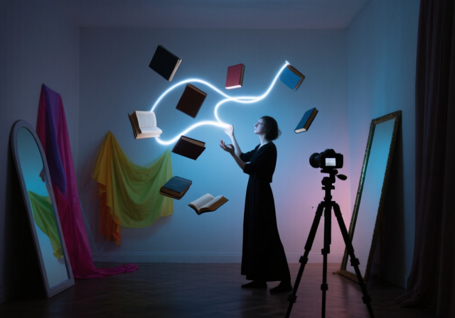
A classic example is a person floating in mid-air, photographed sitting on a hidden support that is later removed digitally. Other common examples include combining a perfect sky from one frame with a landscape from another, or placing multiple copies of the same person in one image to show progression through time.
A good composite maintains consistent lighting, perspective, scale, and color across every element. It uses refined, properly feathered selections without halos or jagged edges, builds realistic shadows that match a single light direction, and applies atmospheric effects to glue layers together. Most importantly, it tells a coherent story or evokes a clear emotion, because technical perfection serves the artistic vision, not the other way around.
Plan your concept before shooting, lock your camera on a tripod at a consistent height, and match lighting across every plate. Shoot RAW, capture multiple variations of each element, and organize layers with clear names. In post, focus on clean selections with proper feathering, accurate color matching, realistic shadow creation, and a final color grade that unifies the entire image.
Adobe Photoshop remains the industry standard for professional compositing because of its layer masks, blending modes, and AI tools like Generative Fill. Affinity Photo 2 is the strongest one-time-purchase alternative. GIMP is a capable free option for budget-conscious shooters. Luminar Neo, ON1 Photo RAW, and Photoshop Express cover AI-assisted and mobile workflows. Choose based on budget, skill level, and how complex your projects tend to be.
A traditional photograph captures a single moment as recorded through the camera lens. A composite image combines elements from multiple photographs to create a new image that did not exist in reality. Photos document what was; composites create what could be, expanding creative possibilities beyond what a single exposure can record.
A simple two-element composite with good source material typically takes three to six hours including shooting and editing. A multi-element fine art composite with five to fifteen plates can take ten to thirty hours across multiple sessions. Complex commercial projects with AI-generated elements, custom brushes, and detailed retouching can run to fifty hours or more. The time shrinks as your library of plates grows and your workflow becomes standardized.
Yes. Photoshop Express, Lightroom Mobile, and Snapseed all support masking, sky replacement, and multi-layer composites on modern smartphones. For quick social-media composites or on-location concepts, phone workflows are more capable than they were a few years ago. For detailed fine art work, a tablet like an iPad with Affinity Photo 2 or Photoshop on iPad still beats most phones for screen real estate and brush precision.
Composite photography is not cheating when presented honestly. It is a legitimate art form with roots going back to the 1850s, practiced by artists from Rejlander to Erik Johansson. The honest line is disclosure: documentary and photojournalism contexts require images to represent reality, so composites must be clearly labeled or avoided. In commercial and fine art contexts, composites are expected and often celebrated, especially when the artist discloses their process and any AI-assisted elements.
Composite photography opens a creative space limited only by your willingness to plan, shoot, and refine. Whether you are drawn to surreal fine art, commercial product work, or simply want to add a few impossible touches to your existing portrait and landscape portfolio, the same fundamentals apply: consistent light, locked-down perspective, clean masks, matched color, and believable shadows. Build those once and every idea above becomes reachable.
Pick one of the fifteen ideas that genuinely excites you and commit to finishing a polished version of it before moving on. Your first composites will not be perfect, and that is the point. Each project teaches a specific skill: masking, color matching, shadow work, environmental interaction, or AI-assisted refinement. Stack those skills and within a few months, you will look back at your early work the way I look at mine, with affection and a clearer sense of how far you have come.
For the technical camera side of things, much of what you already use for night photography, long exposures, and tripod-based landscape work transfers directly into composite shooting. The settings, discipline, and patience overlap more than you might expect, and the techniques I cover in my night photography techniques guide apply almost word-for-word to consistent plate capture for composites.
For more photography guides and tutorials, explore my complete collection of photography guides and tutorials covering everything from basic techniques to advanced artistic concepts. You can also learn more about my photography background and approach to visual storytelling, which has shaped how I think about composite work as a craft rather than a trick.
The world of composite photography awaits, and your impossible scenes are ready to be built. Start with a simple two-element project, finish it cleanly, and let each subsequent piece push a little further. Imagination is the only real ceiling.
![Best Microscope for iPhone [cy]: Complete Photography Guide](https://revellphotography.com/wp-content/uploads/2026/09/featured-update-1121-1789494332484.jpg)