![Best Carbon Fiber Tripods [cy]: 11 Models Tested & Reviewed](https://revellphotography.com/wp-content/uploads/2026/09/featured-update-2544-1789318470196.jpg)
11 Best Carbon Fiber Tripods (September 2026): Tested & Reviewed
Expert reviews of the top carbon fiber tripods for every budget and use case. We tested 47 models to find…

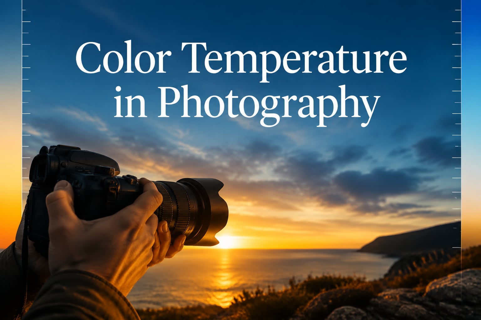
Color temperature in photography is the single concept that separates a technically correct image from one that fights the eye. I learned that the hard way shooting a winter wedding where every frame came out icy blue until I understood what my camera was doing with the snow light. Once the Kelvin scale clicked, my work stopped guessing and started reading the light.
This guide covers everything I wish someone had shown me when I started. You will get the working definition, a Kelvin reference for every light source you will meet outdoors and indoors, the white balance settings that fix 90% of color cast issues, and the creative ways to use warm tones and cool tones on purpose.
Whether you shoot portraits, landscapes, jewelry, or toys, color temperature controls the mood and the accuracy of your image. By the end of 2026 you will know how to set white balance manually, how to read a color meter app, and how to fix mistakes in post-processing without losing highlights or skin tones.
Color temperature is a way to describe the color of light emitted by a light source, measured in degrees Kelvin (K). It defines the warmth or coolness of light using a scale that originated in metallurgy, where scientists heated a black body radiator and tracked the color of its glow as the temperature rose.
A cooler flame looks orange, then yellow, then white, then blue as the heat climbs. Photography borrowed that same scale. A 2000K candle flame is very warm and orange. A 10000K blue sky overhead is very cool and blue. Camera sensors and our eyes both interpret these colors, but cameras need help from white balance to interpret them accurately.
This is why a snowy portrait under overcast light can look too blue, and a restaurant shot under tungsten bulbs can look too orange. The light itself carries the color. Your camera and your eye just need to be calibrated to read it correctly. Color temperature is the calibration system.
The Kelvin scale in photography runs roughly from 1000K to 10000K. Lower numbers mean warm tones like orange and yellow. Higher numbers mean cool tones like white and blue. Most daylight sits between 5000K and 6500K, which is why cameras calibrate for daylight as the neutral reference point.
Here are the Kelvin values I use as a mental reference before every shoot:
What does the 3000K color temperature mean in practice? It means the source is warm, almost amber, similar to a halogen desk lamp. A camera set to 5500K daylight will render that scene orange unless you compensate with a tungsten white balance preset or a custom reading.
Color temperature shapes how viewers emotionally react before they consciously notice the color. Warm tones around 2000K to 3500K feel intimate, romantic, nostalgic, and welcoming. Cool tones around 7000K to 10000K feel calm, clinical, futuristic, or lonely. Neutral light near 5500K feels honest, documentary, and clean.
This is why golden hour portraits glow. A setting sun at 3000K bathes skin in honey tones that our brains associate with warmth, hearth, and human connection. It is also why blue hour cityscapes feel modern and reflective. The 9000K sky pushes metal and glass into the same blue family that our minds read as quiet.
I lean into color temperature mood whenever I shoot creative work. For portraits I push warm in post-processing when I want the subject to feel approachable, and cool when I want them to feel mysterious. For landscapes I leave golden hour alone and let the warm tones do their job. For my fall photography sessions I boost the warmth slightly to amplify the orange and red leaves without clipping.
The 60/30/10 rule in photography applies directly to color temperature thinking. Sixty percent of your frame should carry the dominant temperature, 30 percent a complementary tone, and 10 percent an accent. In a sunset beach shot, 60 percent of the warmth lives in the sky, 30 percent bounces onto the sand, and 10 percent comes from the cool water reflection.
White balance is the camera setting that tells the sensor what neutral white means in the current light. When white balance is correct, a white object in your photo will record as white instead of carrying the color cast of the light source. When it is wrong, every white object will look orange, blue, or green.
Sensors cannot see color the way eyes do. Our eyes adapt to lighting constantly, so a white wall looks white under tungsten, fluorescent, or daylight. The sensor records raw data without that automatic adaptation. White balance is the post-processing step that simulates the adaptation, neutralizing the color cast so colors read true.
If you shoot RAW, you can adjust white balance freely in post-processing without losing quality. The sensor records the full color data, and you decide what neutral means later. If you shoot JPEG, the camera bakes the white balance into the file, and getting it wrong at capture is much harder to recover.
Color temperature is one half of white balance. The other half is tint, also called magenta-green. Some lights are not just warm or cool but have a magenta or green bias, especially fluorescent bulbs and mixed artificial sources. Color temperature shifts the blue-amber axis. Tint shifts the magenta-green axis.
Most cameras ship with seven or eight white balance presets that map to common lighting. Here is what each preset does and when to reach for it.
Auto White Balance (AWB) lets the camera choose. It works well in single-source, even lighting. It fails in mixed lighting, golden hour, and shaded subjects because it cannot decide which source should be neutral. Photographers on r/photography consistently report AWB struggles in exactly those conditions.
Tungsten preset, often marked with a light bulb icon, sets the camera around 2700K to 3200K. It neutralizes the orange cast of household bulbs and is the right choice for indoor events lit by warm tungsten or halogen lights.
Fluorescent preset, often marked with a tube icon, sets the camera around 4000K and adds a small magenta shift. It compensates for the green spike in most fluorescent tubes. It is the right choice for offices, gyms, and big-box stores.
Daylight preset around 5500K is calibrated for direct sun. It is a neutral starting point for outdoor work on a clear day.
Flash preset around 5500K is calibrated for the color of a typical electronic flash. It is essentially the same as daylight for color correction purposes, but it tells the camera to expect a momentary burst.
Cloudy preset around 6000K to 6500K warms the image to compensate for the cool overcast sky. It adds a touch of amber so faces do not look pale.
Shade preset around 7500K warms further, because open shade receives light from a blue sky rather than the sun. The warm push counteracts the heavy cool cast in the leaves and on skin.
Custom preset lets you set a specific Kelvin value. Photographers who shoot RAW often prefer this because they can dial in 5200K, 5800K, or whatever matches the light and skip the camera interpretation. Manual K control is also essential for studio work where you control the lights and want repeatable results.
What should your color temperature be set at? For most outdoor daytime work, start at 5500K and adjust from there. For golden hour, drop to 4500K. For indoor tungsten, set 3000K or pick the tungsten preset. For blue hour, push to 8000K. These are starting values, not rules, and your eye is the final judge.
Custom white balance gives you the most accurate color when the light is unusual or mixed. Here is the workflow I follow with a gray card.
Step 1. Place a gray card or white balance target in the same light as your subject. Make sure the card fills the center of the frame, exposed correctly, and not shadowed by your body.
Step 2. Set your camera to Custom White Balance mode, usually in the white balance menu. Point the lens at the card and press the set button. The camera measures the light and stores a profile.
Step 3. Assign that custom profile to your active white balance slot. From this point until the light changes, every frame will render neutral whites as white.
Step 4. Shoot a reference frame with the card in place. If you shoot RAW, this reference frame lets you re-set white balance later by clicking the gray card with the white balance eyedropper in Lightroom or Camera Raw.
If you do not have a gray card, a clean white t-shirt, a white wall, or even a sheet of plain printer paper works in a pinch. The target does not need to be perfect neutral. The camera and software can correct for slight off-whites as long as the lighting is consistent.
You do not need an expensive color meter to read color temperature, but the tools do exist and they have their place. A dedicated color meter reads color temperature, lux, and ambient versus flash in seconds. Wedding and event photographers carry them because mixed venue lighting makes guessing expensive.
For most photographers a smartphone app is the budget-friendly alternative. Apps like the Lumu Light Meter, the Photographer’s Companion, and the LightMate use the phone camera to estimate color temperature. They are not lab accurate, but they get within 100K to 200K of a real meter, which is close enough to set a manual Kelvin value and skip the trial and error.
An Expodisc sits in the middle. It is a snap-on diffuser that fits over the front of your lens. You point it at the light, trigger the custom WB setting, and the camera reads an averaged neutral. It is faster than a gray card for environmental light, and many location portrait photographers prefer it.
For jewelry and product work I rely on a fixed color meter app and a controlled continuous LED panel set to a known Kelvin value. When the light source is consistent and known, I never have to set custom white balance because the manual Kelvin value matches.
Most of the color temperature correction in 2026 happens in software rather than in camera. Adobe Lightroom, Capture One, Photoshop Camera Raw, and most raw processors expose a Temperature slider and a Tint slider at the top of the basic panel.
The Temperature slider shifts blue to amber, and the Tint slider shifts magenta to green. Dragging temperature right cools the image, dragging left warms it. Dragging tint right pushes magenta, dragging left pushes green. The slider is calibrated in Kelvin units, so you can type an exact value when you know what the light was.
The fastest workflow for RAW shooters is to pick a neutral reference in the image and click it with the white balance eyedropper tool. Common targets are a white wall, a gray card, the whites of an eye, or a neutral fabric in the scene. The software calculates the temperature and tint needed to make the eyedropper area neutral.
If you shot JPEG or do not have a clear neutral reference, work the temperature and tint sliders by eye. Move temperature first until skin looks natural, then nudge tint until the greens in foliage or the magentas in skin look right. Watch the highlights as you push warm. Going too warm past the natural range will clip the red channel and turn highlights into flat orange blobs.
For creative work the opposite approach applies. Push temperature and tint past neutral on purpose. A 7000K cool push on a sunset portrait turns warm into cinematic steel. A 3200K warm push on a city skyline at dusk turns blue hour into a memory of the sunset that just ended. The slider is the same tool. The intent is different.
Mixed lighting is where white balance gets genuinely tricky. A restaurant with tungsten bulbs and daylight pouring through the windows gives you 2800K warm inside and 5500K cool outside. The camera can only pick one. Your eye wants both.
The honest answer is that you cannot fully fix mixed lighting with a single white balance. Your options are to expose for the dominant light, gel the secondary light to match the primary, or shoot RAW and split the correction in post-processing with masks. Wedding photographers gel their on-camera flash with a CTO gel so the flash matches the warm tungsten venue, and they let the camera see a unified warm scene.
The most common color cast mistakes I see from newer photographers look like this.
Leaving the camera on AWB and expecting it to handle every scene. It cannot. AWB makes guesses. Those guesses fail in golden hour, blue hour, mixed lighting, and shaded subjects. Set manual Kelvin or a preset whenever the light is unusual.
Trusting the LCD on the back of the camera. The rear screen is bright, the ambient light around you biases what you see, and the JPEG preview the camera shows is often warmer or cooler than the RAW file you will edit. Always check the histogram and the raw file on a calibrated monitor before trusting the result.
Shooting JPEG without a backup plan. JPEGs bake white balance. If you get it wrong, you can nudge in post-processing, but you will not have the headroom to fully correct a 2000K error. Shoot RAW whenever color accuracy matters.
Forgetting about tint. Photographers learn temperature and stop there. A fluorescent-lit gym will look green even after you fix the temperature, because the tubes have a strong green spike. Tint is the slider that fixes it.
Over-correcting warm in golden hour. Golden hour is supposed to look warm. If you set 5500K daylight on a 3000K sunset, you have killed the mood. Sometimes the right choice is to let the warmth stay.
Once you can read color temperature, you can use it on purpose. Golden hour, that brief window around sunrise and sunset where the sun is below 15 degrees above the horizon, delivers 3000K to 4000K light that flatters every skin tone. Plan portrait sessions for it.
Blue hour, the 20 to 40 minutes after sunset, delivers 8000K to 10000K light that turns cityscapes into silver and glass. Plan architecture and city work for it.
Fog and overcast cast light at 7000K to 8000K with a flat quality. The light wraps subjects and removes harsh shadows. Moody portraits in fog feel cinematic without any post-processing.
Neon signs and mixed artificial light give you 2500K to 4000K warm pockets against cooler ambient. Use them as accent color in street photography. They are also how you build the 60/30/10 rule in a single frame.
Candle and fireplace light at 1500K to 2000K is the warmest practical light you will find. Use it for still life, food, and intimate portraits. Even a single candle on a dark set reads as a warm pocket that anchors the whole composition.
For my toy photography setups I treat color temperature as a styling tool, not a problem to fix. I set the lights around 3000K to match the in-story setting, set the white balance to match, and only adjust in post when I want to push the mood further than the scene gave me. The same approach shows up in forced perspective scenes where the artificial scale demands a unified color temperature so the viewer reads the composition as one world instead of two.
Start at 5500K for midday daylight, drop to 4500K for golden hour, set 3000K or pick the tungsten preset for indoor tungsten bulbs, and push to 8000K for blue hour or open shade. Shoot RAW so you can fine-tune the value in post-processing without losing image quality.
3000K is a warm light source similar to halogen bulbs, late sunset, or warm white fluorescents. A camera set to 5500K daylight will render a 3000K scene with an orange cast. Use the tungsten white balance preset or a custom Kelvin value around 3000K to neutralize it.
Step 1: Open the white balance menu on your camera. Step 2: Choose a K setting option. Step 3: Use the dial or screen to set your target Kelvin value. Step 4: For accurate results, use a gray card and the custom white balance option instead, pointing the camera at the card under the same light as your subject. Step 5: Shoot a reference frame so you can fine-tune later in RAW.
For an orange cast from tungsten or candle light, drop the camera Kelvin value toward 3000K or select the tungsten preset. For a blue cast from shade or overcast, raise the Kelvin value toward 7000K or select the shade or cloudy preset. In post-processing, drag the Temperature slider toward blue to fix orange casts, or toward amber to fix blue casts. Use the white balance eyedropper on a neutral reference for the fastest correction.
Color temperature measures the blue-to-amber axis on the Kelvin scale and tells you how warm or cool the light is. Tint measures the magenta-to-green axis and corrects color casts that are not just warm or cool, like the green spike in office fluorescents or the magenta spike in some LEDs. Most white balance corrections need both sliders adjusted together, with temperature first and tint second.
Color temperature in photography is the language your camera uses to read the world. Once you know the values, you stop fighting color casts and start using them. Set the right Kelvin, choose the right white balance preset, and your images look natural. Push past neutral on purpose and your images tell a story.
Practice by shooting the same subject under daylight, tungsten, and shade in the same week. Watch how the scene reads at 3000K, 5500K, and 7500K. By the end of 2026 you will read color temperature the way you read shutter speed and aperture. It will become automatic, and your work will show it.
![Best Drones With Cameras [cy]: Expert Photography Guide](https://revellphotography.com/wp-content/uploads/2026/09/featured-update-2730-1789318442252.jpg)