Artificial Light Photography: Complete Guide for 2026
Artificial light photography uses man-made light sources such as flashes, LED panels, and strobes to illuminate your subject instead of…

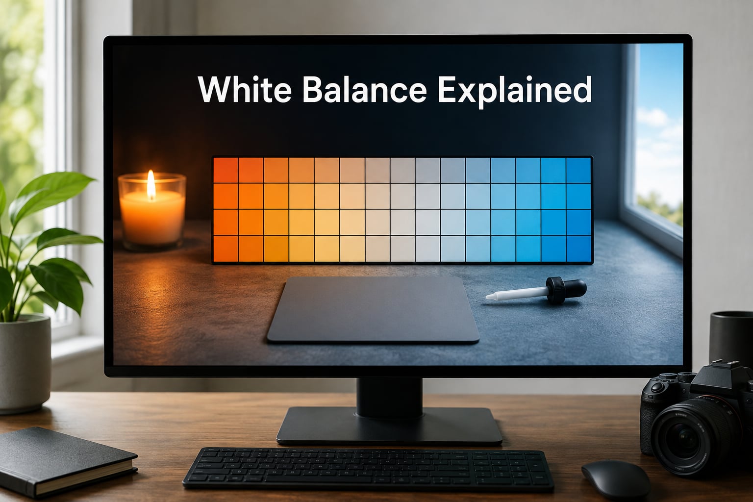
White balance is a camera setting that removes unrealistic color tints so white objects look truly white and every other color in the frame appears natural. Whether you shoot a smartphone snap or a studio portrait, your camera is constantly making decisions about the color of light, and getting white balance explained properly is the first step toward images that look the way your eyes remember the scene.
I’ve spent years teaching photographers the same set of principles, and the truth is that white balance is one of those topics that sounds technical but becomes intuitive the moment you understand the Kelvin scale. In this guide I’ll walk you through color temperature, presets, custom settings, RAW workflow, post-processing, and even the creative side of white balance. If you’re new to photography, our co-witness sights guide covers another foundational concept in plain language, and the same approach applies here.
By the end of 2026 you’ll know why indoor shots turn orange, why snow scenes turn blue, and how to control all of it on purpose instead of fighting it after the fact.
White balance is the process of neutralizing color casts caused by different light sources so that whites render as white and skin tones stay lifelike. Every light source, from a candle to noon sunlight, emits light at a measurable color temperature, and your camera’s sensor records that color directly. Without correction, that color tint ends up baked into your image.
The reason it matters is simple: viewers judge photos against the colors they remember. A photo of a white wedding dress that looks slightly yellow looks wrong, even if most viewers cannot articulate why. A portrait with a green tint from fluorescent lighting looks sickly. Get the white balance right and your images look clean, professional, and trustworthy.
White balance is also one of the most powerful creative levers you own. The same scene shot at 3200K and 5600K tells two completely different stories. Mastering white balance means mastering the emotional palette of your photography.
Color temperature describes the color of a light source measured in Kelvin (K). Lower Kelvin values mean warmer, more orange or yellow light, while higher Kelvin values mean cooler, more blue light. The scale is counterintuitive at first because a candle flame is hot but reads as warm orange, while a clear blue sky is cold but reads as cool blue.
Here is a practical Kelvin reference chart that I keep taped inside my camera bag:
Above 10,000K you start climbing toward the bluish-white of high-altitude snow scenes. The point is not to memorize every value, but to anchor yourself: 5500K is the photographer’s reference white, and every other temperature is a deliberate step away from it. When your photo looks too orange, you push Kelvin up. When it looks too blue, you push Kelvin down.
Every modern camera ships with white balance presets designed for common lighting situations. Presets are not magic, they are simply convenient shortcuts to a specific Kelvin value plus a tint correction.
Auto white balance lets the camera analyze the scene and pick a Kelvin value on its own. AWB works surprisingly well outdoors in even daylight, and it fails predictably indoors, at events with stage lighting, or anywhere multiple light sources mix. Most working photographers leave AWB on as a safety net while shooting RAW, because the final word happens later in post-processing.
Daylight sits around 5500K and is your neutral reference. Cloudy nudges warmer, usually around 6000K, to compensate for the cool cast of clouds. Shade pushes further warm, around 7500K, because open shade is lit almost entirely by blue sky. These three presets cover the bulk of landscape and outdoor work.
Tungsten is built for old-school incandescent bulbs and cools the image down to about 3200K. Fluorescent attempts to neutralize the green spike of fluorescent tubes and lands around 4000K with a magenta tint correction. Both presets struggle with modern LED lighting, which is why custom white balance has become so important.
Flash preset assumes roughly 5500K, matching the color temperature of most speedlights. Custom white balance lets you point the camera at a neutral gray or white target under the actual lighting and tell the sensor to treat that target as white. Custom is the gold standard for product photography, food photography, and any situation where color accuracy matters more than convenience.
Setting white balance in camera is straightforward once you know where the menu lives. Here is the step-by-step process that works on virtually every brand.
Most professional photographers do not bother with custom white balance in fast-changing situations. We shoot RAW with AWB and adjust later. The exceptions are studio product work, food photography, and any scenario where the lighting is locked and color accuracy is contractual.
Post-processing is where most photographers, including myself, do their final white balance work. Software like Adobe Lightroom, Photoshop, Capture One, and even free tools like RawTherapee all expose temperature and tint sliders that mirror the in-camera Kelvin controls. If you are new to editing, our mil dot guide walks through another commonly misunderstood setting in the same plain-language style.
The temperature slider runs from cool (blue) on the left to warm (yellow) on the right, mapped to the Kelvin scale. The tint slider runs from green on the left to magenta on the right and compensates for the green or magenta spike of certain light sources, particularly fluorescent tubes and some LEDs. Most of the time you only need temperature; tint comes into play under artificial lighting.
Lightroom and Photoshop ship with a white balance eyedropper. Click it on anything in your image that should be neutral gray, and the software calculates the correct temperature and tint automatically. Aim for a sidewalk, a white shirt, a gray card, or any other known-neutral target. The eyedropper is the single fastest way to fix a white balance mistake.
That five-step workflow handles roughly 90% of white balance fixes for me on any given shoot.
RAW files record everything the camera saw, including the full color temperature data. JPEG files bake in a white balance decision at the moment of capture and throw the rest away. With a RAW file you can shift from 3200K to 8000K after the shoot with no quality penalty. With a JPEG you are stuck.
This is the single biggest reason experienced photographers shoot RAW. White balance is not the only setting you can rescue, exposure latitude and shadow recovery are equally forgiving, but white balance is the most common reason people reach for the RAW safety net.
If storage space is a concern, modern cameras make it easy to shoot RAW plus JPEG simultaneously. You get the JPEG for quick sharing and the RAW for serious editing.
A gray card is a neutral 18% gray reference that reflects all wavelengths of light equally. Photographers use it to set custom white balance and to expose scenes accurately. A color checker goes further, providing a known set of color patches that lets you build a custom camera profile in post-processing.
For product photography, food photography, and any work where color accuracy is part of the contract, a gray card or color checker is non-negotiable. Photograph it once under your key light, set custom white balance from it, and your entire shoot stays color-consistent. Forum photographers on r/photography and r/Photoassistants consistently recommend this approach.
If you shoot events with mixed lighting, indoor corporate work, jewelry, art reproduction, or anything destined for print, invest in a gray card. If you only shoot casual family snapshots, your AWB plus RAW workflow is plenty.
White balance is not just a corrective tool, it is a creative one. The same scene can feel warm, cozy, and nostalgic at 3200K, or cold, clinical, and lonely at 7500K. The choice is yours, and choosing on purpose separates photographers from snapshot-takers.
For portraits, a slightly warm white balance (around 5500K to 6000K) tends to flatter skin tones and add life. For landscapes, going cooler (around 6500K to 7000K) preserves the blue of sky and water. For street photography, leaving a tungsten cast in place can evoke a film noir feeling. For product work, color accuracy usually wins over mood.
The Adobe guide on white balance is the only major competitor that leans hard into this creative angle, and it is genuinely worth reading after you finish this article.
Different genres lean on white balance in different ways. Knowing the conventions of your genre helps you make smart defaults before you even look at the histogram.
Portraits live or die by skin tone accuracy. Shoot RAW, use AWB as a starting point, and fine-tune in post to land skin tones slightly warmer than neutral. Avoid magenta casts at all costs, they make skin look bruised. Our telescope versus microscope guide covers precision optics for a different kind of detail work, but the same principle of getting color and clarity right applies.
Landscape photographers usually lean cooler than reality, often landing around 6000K to 7000K, to preserve the blue of sky and the cool feeling of distance. Golden hour is the exception, where warm presets amplify the magic.
Accuracy is everything. Use a gray card, locked lighting, and custom white balance. There is no creative latitude here, the client expects the product to look the way it looks in person.
Auto white balance often fails at weddings, conferences, and concerts because of mixed lighting. Shoot with AWB on RAW, then batch-adjust in post to keep a consistent look across hundreds of frames.
Video adds a wrinkle that photography does not have: white balance is much harder to change in post when you shoot video. Long-GOP codecs like H.264 and H.265 do not retain the same color flexibility as RAW video or as a still RAW file. Shifting white balance in video editing introduces banding, noise, and color drift across the frame.
This is why videographers obsess over getting white balance right in camera. They use preset white balance matched to known lighting, custom white balance with a gray card, or professional monitor tools like the X-Rite ColorChecker Video. AWB in video also tends to hunt, drifting mid-shot as the camera reframes, which is jarring to viewers.
If you shoot both stills and video on the same camera, treat them differently. Trust RAW for stills, trust presets for video.
Even experienced photographers make white balance mistakes. Here are the most common ones I see, and how to fix them.
AWB sees a room lit by tungsten, fluorescent, and window light and tries to average them into something neutral, which usually results in a color cast somewhere strange. Shoot RAW and fix in post, or use a gel to match all your lights to one color temperature.
Cranking temperature 2000K in the opposite direction does not fix a color cast, it creates a new one. Make tiny adjustments, then step away from the monitor for a minute. Color fatigue is real and your eyes adapt to whatever they have been staring at.
Many photographers adjust temperature but leave tint at zero. Under fluorescent or LED lighting, the tint slider matters more than the temperature slider. Always check both.
If you shoot 400 frames at a wedding and then tweak white balance on one of them, the series no longer looks consistent. In Lightroom, copy your edit to the entire shoot once you have one frame dialed in.
The 20-60-20 rule is a workflow philosophy that helps photographers manage their attention and energy across a session. Spend 20% of your time on planning and setup, 60% on shooting the most important moments, and reserve the final 20% for capturing spontaneous moments and creative variations you did not plan for.
Applied to white balance, the rule looks like this: spend 20% of the shoot locking down your color workflow (custom white balance, gray card, test frames), spend 60% shooting confidently with that locked workflow in place, and reserve 20% for creative white balance experiments where you push temperature to capture mood. The rule keeps you from either overthinking color in the moment or ignoring it entirely.
There is no single best white balance setting, only the best setting for your situation. The right choice depends on your genre, your lighting, your format, and your tolerance for post-processing.
Trust AWB for casual outdoor shooting, travel snapshots, and any situation where you cannot predict the lighting. Pair it with RAW and you can fix almost anything later.
Use presets when the lighting is consistent and known, such as a sunny day, a clear tungsten-lit room, or a shaded outdoor scene. Presets give you a quick, repeatable baseline.
Use custom white balance for studio work, product photography, food photography, art reproduction, and any situation where color accuracy matters more than speed.
Fix in post for everything else. RAW files give you the flexibility to fine-tune temperature and tint after the shoot, which is the most common professional workflow.
A consistent white balance workflow saves hours in the editing room and keeps a series of images looking like one cohesive body of work. Here is the workflow I teach every photographer I mentor.
This workflow takes five minutes per shoot and saves hours of inconsistent editing later.
The 20-60-20 rule is a shooting workflow that splits a session into three blocks. Spend 20% of your time on planning and setup, 60% on capturing the most important planned shots, and the final 20% on spontaneous creative experiments. Applied to color, it means locking down a white balance baseline, shooting the bulk of the work confidently, and reserving time to push temperature creatively for mood.
Two-point white balance lets you set temperature and tint independently with two separate reference readings. Twenty-point white balance, available on some professional cinema cameras, lets you sample up to 20 reference points across the frame and average them into a single highly accurate white balance. Both features exist to handle complex mixed lighting that single-point systems cannot solve.
Open your RAW file in Lightroom, Photoshop, or another editor that supports RAW processing. Use the white balance eyedropper and click on a known-neutral area like a gray card, white shirt, or sidewalk. If the result still looks off, drag the Temperature slider toward blue or yellow until whites look white, then adjust the Tint slider to neutralize any remaining green or magenta cast. Apply the corrected settings across the entire series for consistency.
At night most artificial lighting sits between 2500K and 4000K. Tungsten bulbs are around 2800K, warm LEDs are around 3000K, and fluorescent tubes are around 4000K. Set your Kelvin to match your dominant light source, or use a custom white balance with a gray card. If you want a moodier, more cinematic feel, leave the warm cast in place and shoot around 3200K without correcting.
There is no single best white balance setting, because the right answer depends on your light source. Daylight is approximately 5500K, tungsten is approximately 3200K, and shade is approximately 7500K. For most situations the most reliable workflow is to shoot with Auto White Balance enabled in RAW format, then fine-tune temperature and tint in post-processing using an eyedropper tool.
White balance is one of the few settings that affects every single photo you take, and once you understand the Kelvin scale and presets, it stops feeling like guesswork. The white balance explained approach I trust most in 2026 is simple: shoot RAW, lean on Auto White Balance for variable lighting, switch to presets when conditions are predictable, and reach for custom white balance when color accuracy is non-negotiable.
Build a color-consistent workflow, learn to trust the eyedropper in post, and remember that white balance is also a creative tool, not just a corrective one. Get that trifecta working and your photography in 2026 will look more professional, more consistent, and more like the scenes you remember than ever before.